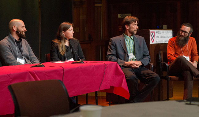
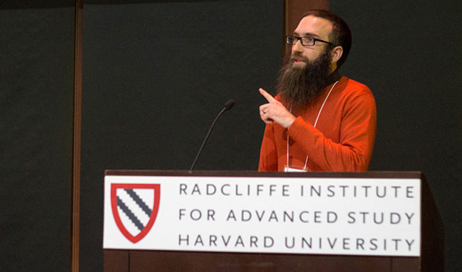
Last week, speakers from fields as diverse as astrophysics and economics came together for Thinking with Your Eyes: Visualizing the Arts, Humanities & Sciences, a two-day symposium on data visualization. Organized by Harvard’s Digital Futures consortium with collaborators from across campus, including the Harvard Art Museums, the conference was held at the Knafel Center at Harvard’s Radcliffe Institute for Advanced Study and featured a packed schedule of speakers, panel discussions, and interactive technology demonstrations. Jeff Steward, our director of Digital Infrastructure and Emerging Technology (DIET), gave a short “lightning talk” about his experience working with our collections data.
The symposium’s far-ranging topics included the study of the effectiveness of using 3D modeling of blood vessels for medical diagnosis, presented by Michelle Borkin, doctoral candidate at the Harvard School of Engineering and Applied Sciences, as well as a call by Yanni Loukissas of metaLAB not to be so quick to “clean” your data and remove interesting details about how it was made. A pair of talks on the history of visualization by professors Jennifer Roberts and Robin Kelsey, from Harvard’s History of Art and Architecture department, demonstrated just how much we take for granted in the projections used to make maps. And artist Nathalie Miebach revealed her process for representing data through basket-weaving.
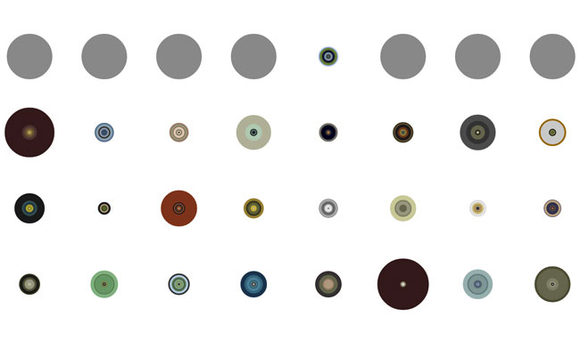
In his talk, Steward presented visualizations based on data connected to the museums’ collections. He showed images that reveal new ways of seeing works of art—from color-based and graph-based abstractions of a Van Gogh self-portrait to a high-level depiction of the Wertheim Collection, in which every pixel served as a representation of a data point. According to Steward, data visualization is a natural response for anyone who works with collections data. “We sort it, slice it, aggregate it, look at it sideways,” he said. “We are constantly shifting our perspective on the collections without having to look at the actual art.”
Two themes that emerged from the symposium were the importance of “thinking interdisciplinary”—of applying what we learn from other disciplines to our own field of study; and how visualizing data can, in the words of Ryan Cordell, assistant professor of English at Northeastern University, “reveal things worth investigating, things we have no idea exist.” DIET’s Technology Support Specialist Ian Callahan found in those ideas a confirmation of his department’s approach to visualization and working with information. “There’s a broad range of voices and expertise within the museums,” he said. “We here in DIET expect that we will need to work across disciplines to discover and share interesting things about our collections data.”
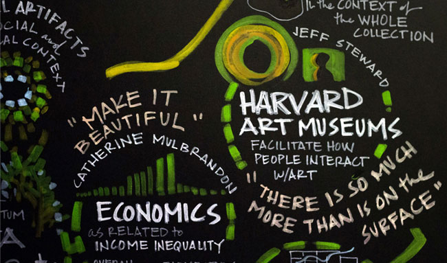
All presentations were captured in a real-time visualization by graphic facilitator Kelvy Bird. The drawings she made are a fitting artifact of Thinking with Your Eyes.